
Fundbox.ai - Simplifying Investment Insights
Fundbox.ai - Simplifying Investment Insights
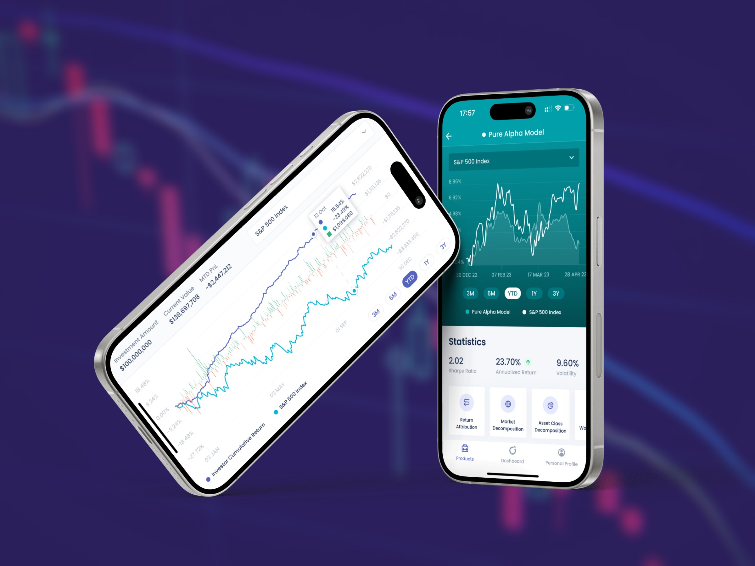
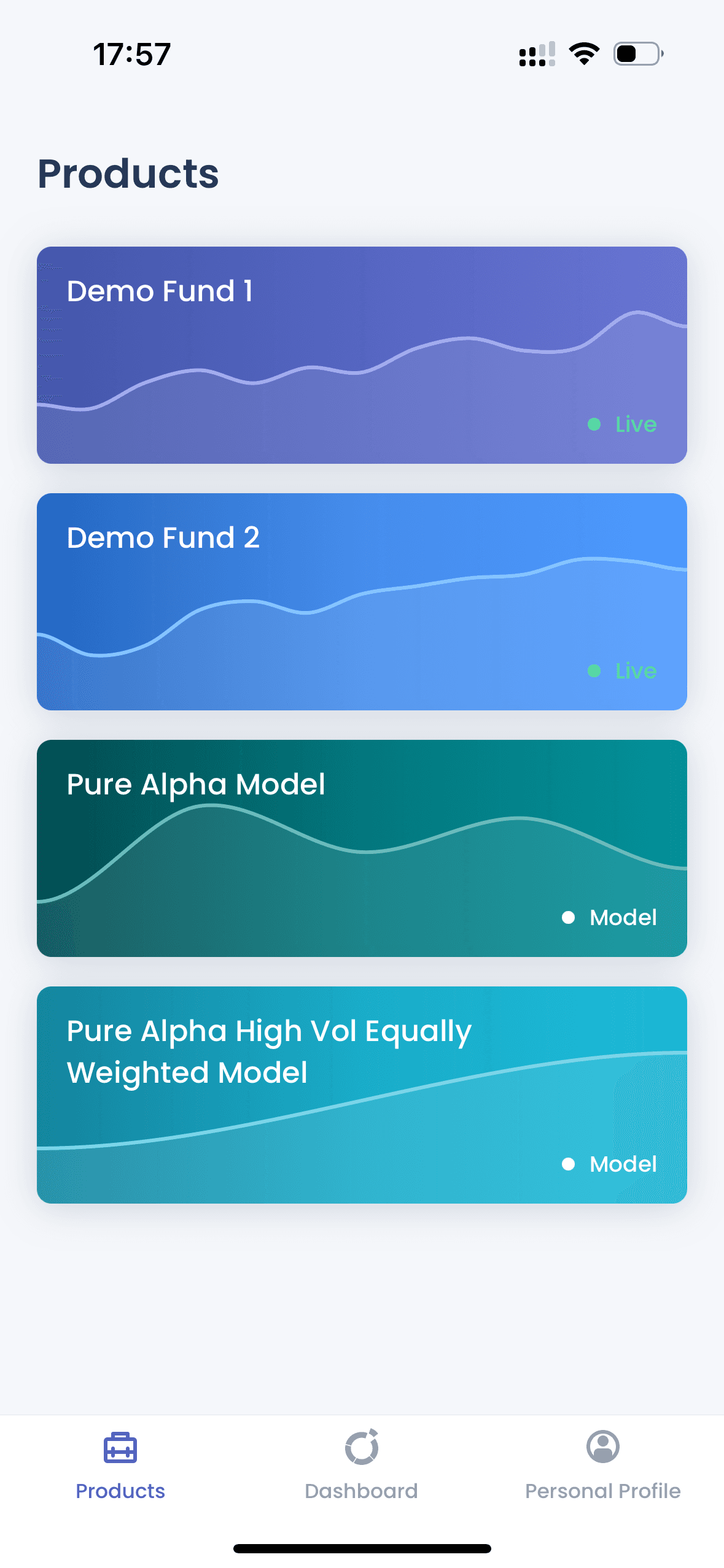
When Noviscient, a Singapore-based startup catering to major portfolio holders, approached us, they were clear about their needs: an investor's dashboard app for their product - Fundbox.ai, that would allow users to effortlessly compare various fund performances and delve into detailed fund compositions. Given the app was intended for Noviscient's early customers—who were not just users but also investors in the company—the stakes were high to deliver something both sophisticated and user-friendly. This project marked our first dive into developing with SwiftUI, presenting a unique blend of challenges and learning opportunities.
When Noviscient, a Singapore-based startup catering to major portfolio holders, approached us, they were clear about their needs: an investor's dashboard app for their product - Fundbox.ai, that would allow users to effortlessly compare various fund performances and delve into detailed fund compositions. Given the app was intended for Noviscient's early customers—who were not just users but also investors in the company—the stakes were high to deliver something both sophisticated and user-friendly. This project marked our first dive into developing with SwiftUI, presenting a unique blend of challenges and learning opportunities.
Challenge
Our challenge was to develop a native iOS fintech app that could accurately present complex investment data in a user-friendly dashboard, under time and budget constraints.
Solution
We used SwiftUI to craft custom charts and interactive elements, focusing on accurate data presentation and a UI that matches Apple’s Human Interface Guidelines.
Outcome
The feedback from Noviscient team was positive, demonstrating our ability to meet the project's goals and contribute to the fintech app landscape.


Challenge
Investment App with Complex Charts
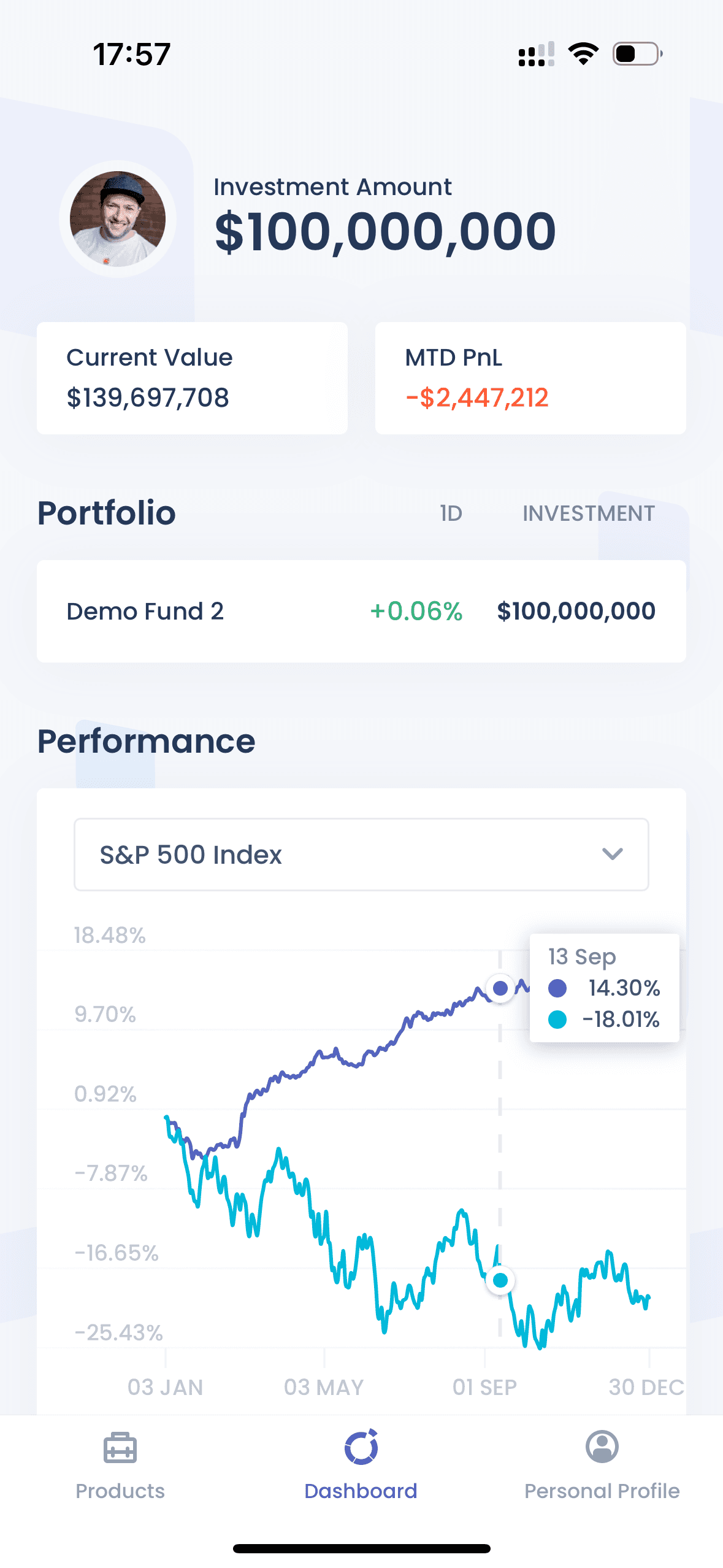
The task at hand was to build a native iOS app for Fundbox.ai, Noviscient's latest product, that made it easy for investors to access and compare their investment data. The app had to be straightforward, avoiding information overload while ensuring that users could gain insights into their portfolios with ease. This meant diving into the specifics of native iOS development to leverage SwiftUI's capabilities for creating an intuitive user interface that could handle the intricacies of financial data.


“
This project was our first experience developing an app so I can’t think of anything they could improve on. It was just a perfect collaboration.

Denis Volokh
CTO, Noviscient
“
This project was our first experience developing an app so I can’t think of anything they could improve on. It was just a perfect collaboration.

Denis Volokh
CTO, Noviscient
“
This project was our first experience developing an app so I can’t think of anything they could improve on. It was just a perfect collaboration.

Denis Volokh
CTO, Noviscient



Solution
Utilising SwiftUI to Drive Innovation
Choosing SwiftUI for Development The decision to use SwiftUI for this project was strategic and forward-thinking, allowing us to fully leverage native iOS development capabilities. Opting for SwiftUI enabled us to create a fluid and responsive user interface, tailored for a sophisticated fintech app. This choice was a significant step in our journey, embracing the potential of SwiftUI to deliver high-quality, native app experiences, making the app more future-proof and significantly reducing the amount of technical debt. This approach ensured that we were building on a solid, modern foundation, ready to adapt to future iOS updates and enhancements seamlessly.
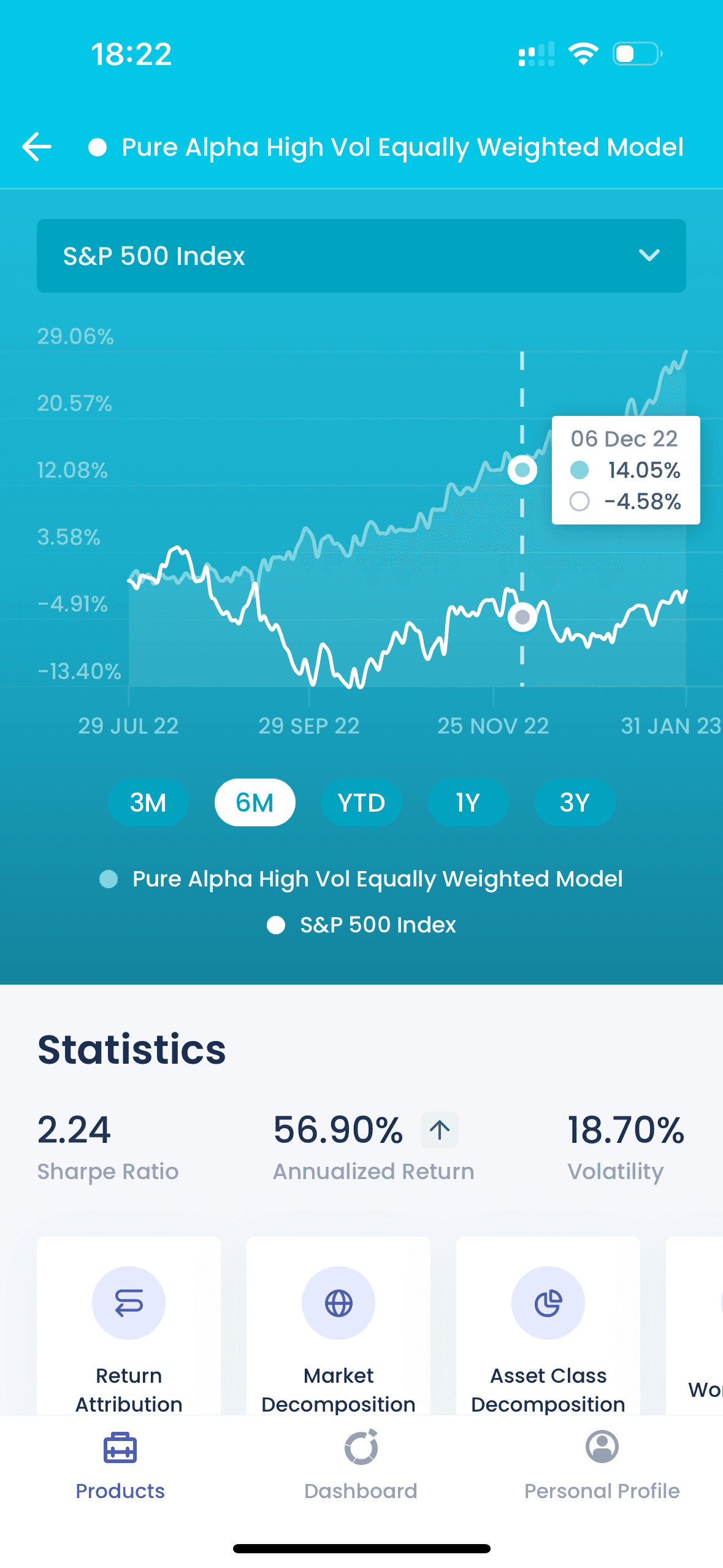
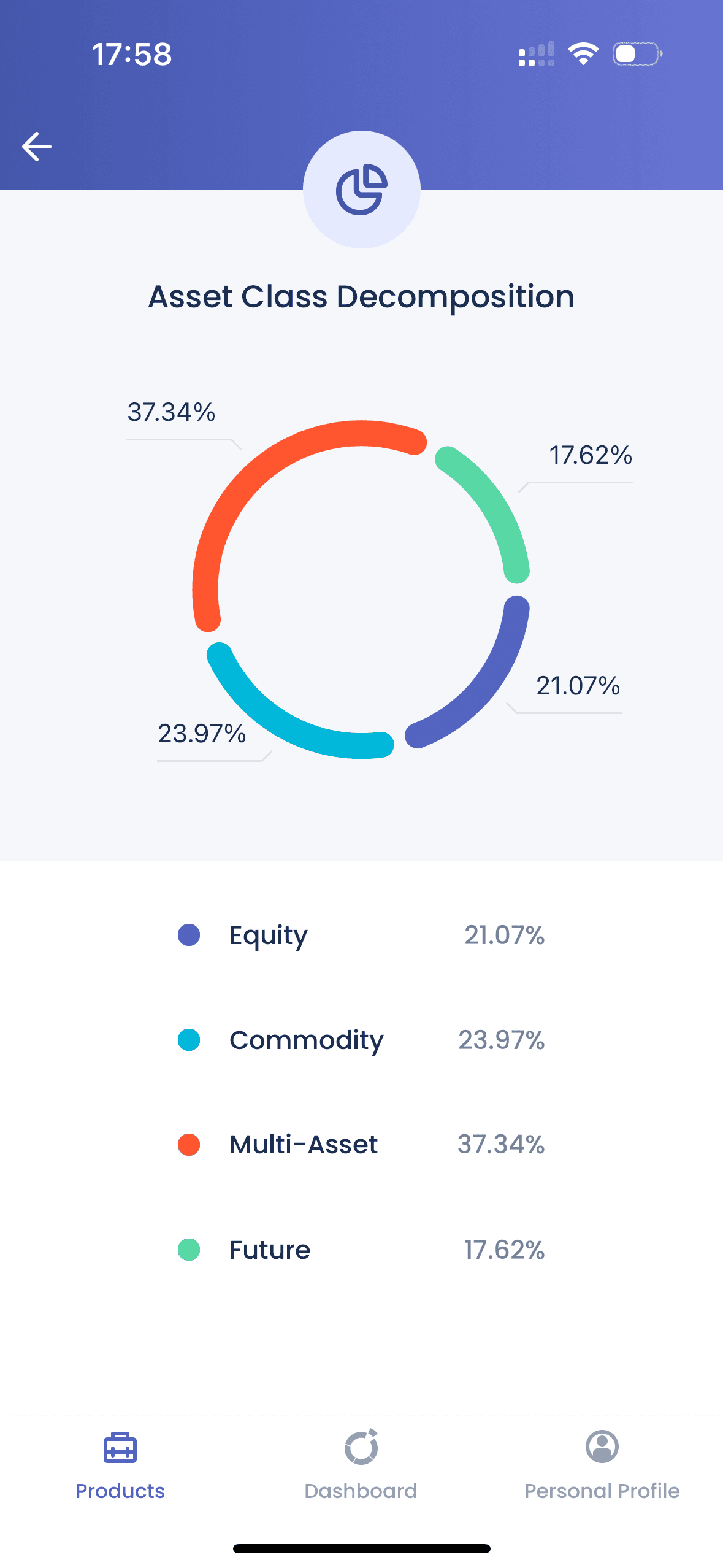
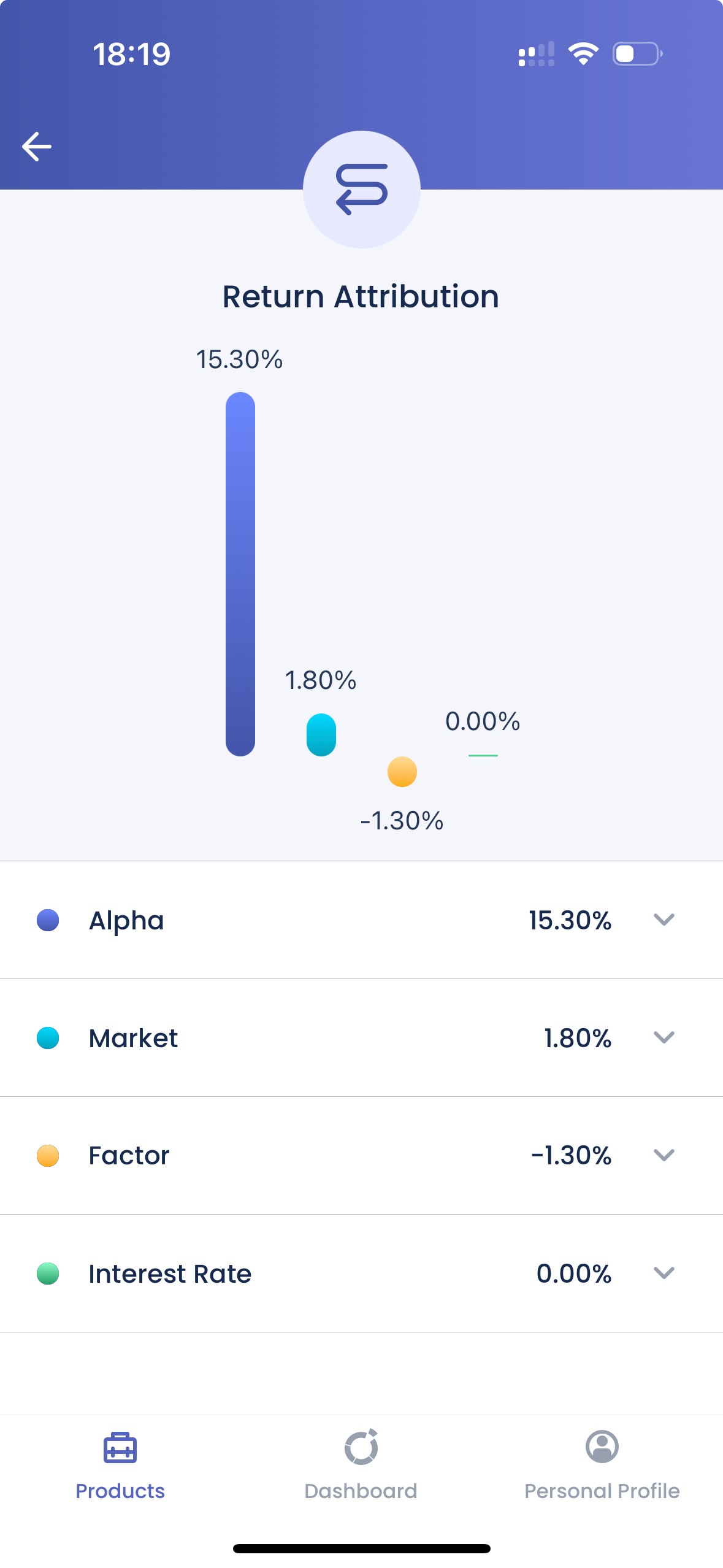
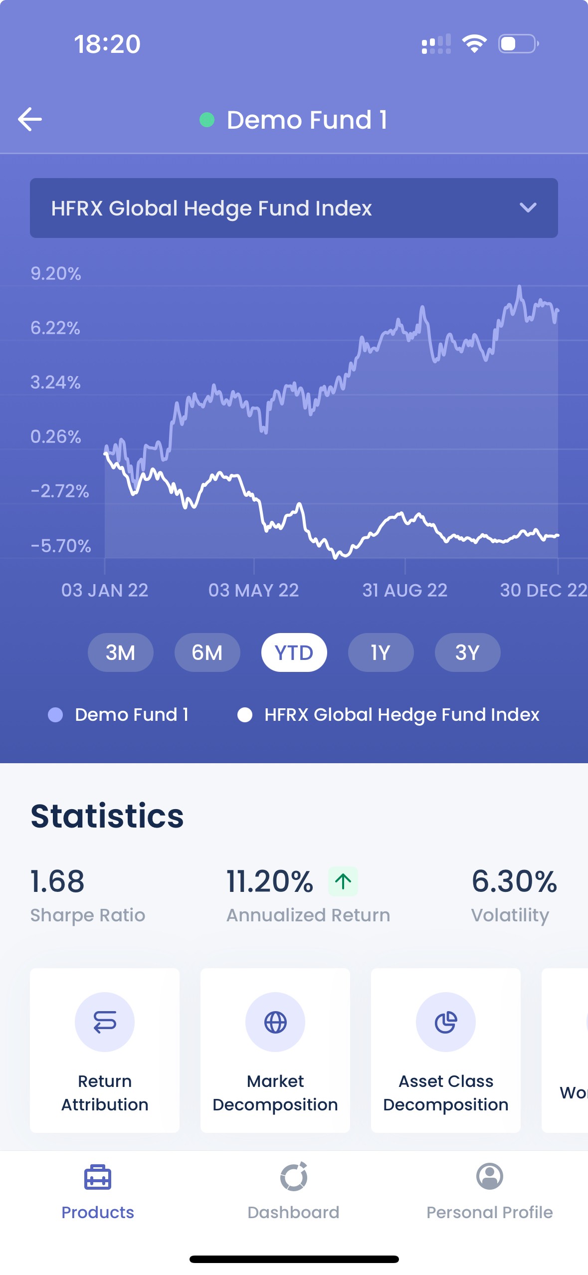
Interactive Charts with Precision The heart of the app's functionality lay in its interactive charts, allowing users to easily compare funds' performances. These charts, including time-based performance comparisons and detailed breakdowns of market compositions, were fine-tuned with a smoothing algorithm. This ensured that while the charts were aesthetically pleasing, they did not compromise on the accuracy of showing critical financial data points, striking a balance between smooth visuals and data integrity.
Design Collaboration Working in tandem with a design bureau, we transformed initial designs into a polished SwiftUI application. This collaboration was key to ensuring the app was functional and visually appealing. We guided the design team on adopting Apple’s Human Interface Guidelines, ensuring the final product would resonate well with users familiar with the iOS ecosystem.


Outcome
Practical Lessons
Completing the Fundbox.ai app provided us with valuable lessons in using SwiftUI, enhancing our toolkit for native iOS development. This project was a significant learning opportunity, giving us firsthand experience with the framework's capabilities and challenges. We appreciated the feedback from the designers who highlighted our efforts to meticulously implement their vision within the technical constraints of SwiftUI.



“
The designers who got to try the application were very impressed with the quality of the app.

Denis Volokh
CTO, Noviscient
“
The designers who got to try the application were very impressed with the quality of the app.

Denis Volokh
CTO, Noviscient
“
The designers who got to try the application were very impressed with the quality of the app.

Denis Volokh
CTO, Noviscient
Wrapping Up
The journey with Fundbox's app was challenging and rewarding, pushing us into new territories of app development with SwiftUI. We're excited to take these learnings and apply them to future projects, always aiming to blend technical prowess with aesthetic finesse.
Looking to develop a fintech app or another innovative project? We are ready to leverage our experience for your success. Reach out to us, and let's start crafting your next solution together.
Challenge
Wrapping Up
The journey with Fundbox's app was challenging and rewarding, pushing us into new territories of app development with SwiftUI. We're excited to take these learnings and apply them to future projects, always aiming to blend technical prowess with aesthetic finesse.
Looking to develop a fintech app or another innovative project? We are ready to leverage our experience for your success. Reach out to us, and let's start crafting your next solution together.
We’ve worked with clients of all sizes, from major brands to funded startups. Let’s discuss your project and explore how we can help you building it.
Or simply drop us an email at hello@appuchino.com
© Appuchino, all rights reserved.
We’ve worked with clients of all sizes, from major brands to funded startups. Let’s discuss your project and explore how we can help you building it.
Or simply drop us an email at hello@appuchino.com
© Appuchino, all rights reserved.
We’ve worked with clients of all sizes, from major brands to funded startups. Let’s discuss your project and explore how we can help you building it.
Or simply drop us an email at hello@appuchino.com
© Appuchino, all rights reserved.
Privacy Policy

